Choose the anchor
Start with the hardest outfit to change: a dress, jacket, or the room’s strongest color. Everything else supports it.
Family photo outfit ideas
The easiest way to coordinate a group portrait is to choose a color story, then let each person wear it differently. Start with one anchor, balance the light and dark pieces, and leave room for real texture.
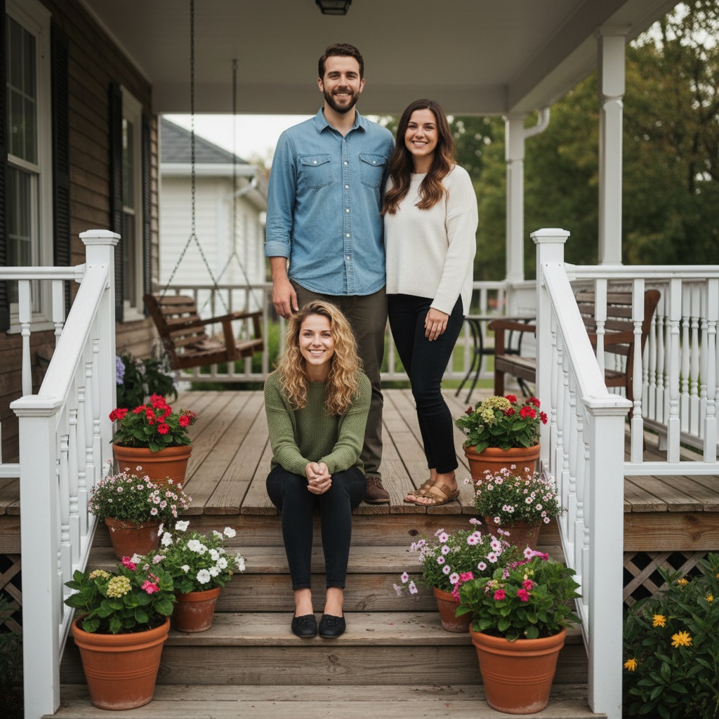 A color story
01 Five colors. Different people. One frame.
The five-minute plan
Do this before anyone shops. You will get a stronger result from clothes already in the family’s wardrobes than from five new matching outfits.
Start with the hardest outfit to change: a dress, jacket, or the room’s strongest color. Everything else supports it.
Aim for light, middle, and deep pieces. A family looks connected when the values are balanced, not identical.
Repeat a color in two different garments or accessories. Do not put the same shade on everyone.
Keep logos, neon, tiny stripes, and reflective jewelry away from the center of attention.
Start with a color story
Use these as a starting point, not a dress code. The hex values are a visual guide; fabric, shade, and the actual background matter more than an exact match.
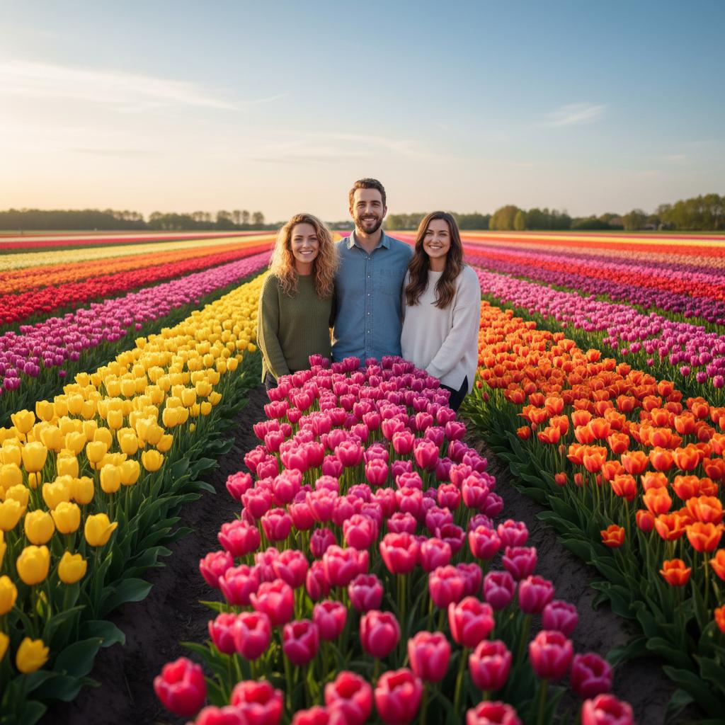 01
01 Soft ivory and sage do the quiet work. Add dusty blue for a midtone and repeat clay rose once near a face.
Load this palette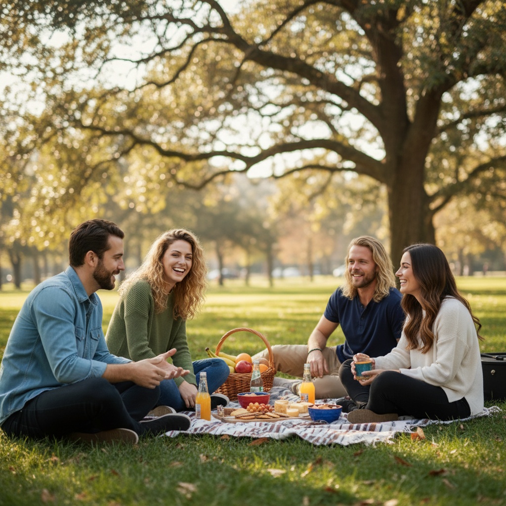 02
02 Use breathable solids and one warm accent. Let navy or fern ground the frame so pale pieces do not float away.
Load this palette 03 Rust and deep teal make strong anchors. Spread oat and camel across layers so one person does not carry the whole palette.
Load this palette 04
04 Put oatmeal or wool gray near faces. Use cranberry once, then let evergreen and charcoal carry the lower half of the frame.
Load this paletteTexture beats another color
Pair linen with denim, a knit with cotton, or a soft cardigan with a crisp shirt. The camera sees the difference without turning the group into a pattern wall.
Keep solids, subtle checks, denim, knits, corduroy, and natural layers.
Skip tiny stripes, giant logos, reflective details, neon, and five different statement prints.
The night-before check
A palette can be right on screen and wrong in the room. Do one final check in the actual light, with the actual background.
Lay every outfit on one bed before photo day.
Remove one piece if the palette has more than one loud pattern.
Check the background: grass, walls, and sky count as colors too.
Keep one layer handy for anyone who needs more contrast near their face.
Take a quick phone snapshot in the actual light before everyone leaves.
The next step
Use the palette as your brief, then bring separate portraits into one clearly disclosed TogetherLens scene. Review the result with everyone pictured before you share or print it.
Open the free palette plannerPrefer the native app?
Save the palette, then make the photo when you are ready.Before photo day
Choose three values—light, middle, and deep—with one small accent. Soft neutrals, muted blues, greens, rust, and denim are easier to coordinate than several bright colors.
Coordinate instead of matching. Repeat a few colors across different garments, vary the shades, and keep one person from carrying every strong color.
Avoid tiny stripes, prominent logos, neon, and several competing patterns. Also check whether white disappears into the background or black loses detail in shade.
Yes. The free TogetherLens palette planner runs in your browser and asks only for season, setting, and group size. It does not require an account or photo upload.